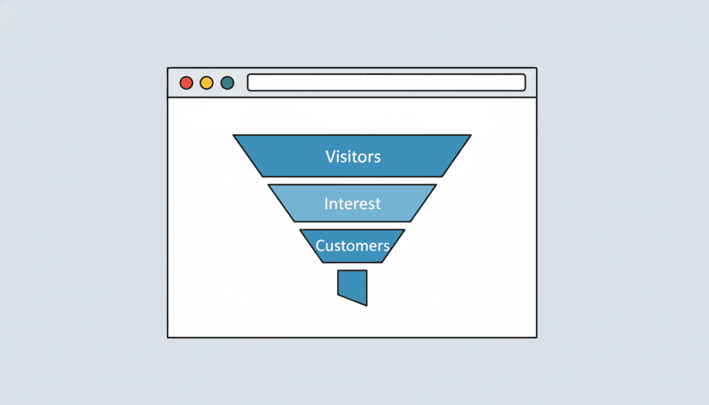
Beautiful design gets a visitor to stay. Conversion architecture turns them into a lead. Most websites get the first part wrong, and almost all get the second part wrong. Here’s what actually makes the difference.
The Core Principle: Clarity Converts
The single biggest conversion problem we see on business websites isn’t poor design — it’s confusion. A visitor arrives and within ten seconds can’t answer three basic questions: What does this business do? Is it for me? What should I do next?
Every design and copy decision on a converting site is in service of those three questions. If a visitor has to hunt for what you do, navigate multiple menus to find your services, or wonder whether you serve their area — they don’t convert. They leave.
Good conversion starts before the homepage is designed. It starts in discovery, when you actually understand who your customers are, what they’re looking for, and what objections they have before they contact you. That’s foundational to our approach to custom web design.
What the Top of the Page Has to Do
Most visitors never scroll past the fold on a first visit. Your hero section — the visible area before any scrolling — has to do a lot of work fast:
- Clear headline: What you do, for whom, and where. Not a tagline. Not a mission statement. A specific, direct statement of value.
- Supporting subheadline: One sentence that handles the first objection or amplifies the core promise.
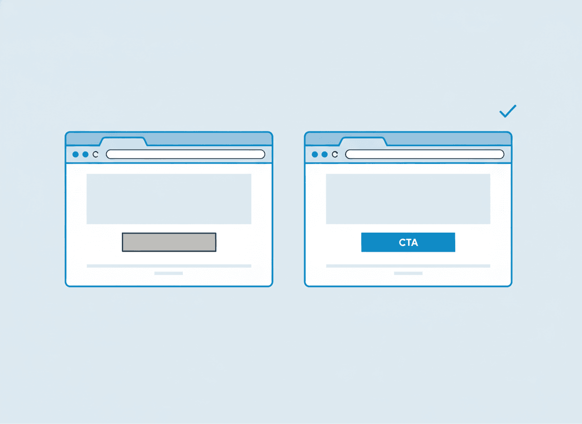
- Primary CTA: One clear next step. Not three buttons, not a menu of options — one action you want the visitor to take.
- Trust signal: A review badge, a client logo, a credential, or a simple proof statement. Something that says “you’re in the right place.”
This sounds simple. Almost every site gets it wrong by trying to say too many things at once, using clever language that obscures the message, or leading with the company story instead of the customer benefit.
Copy That Actually Persuades
Design brings visitors to the words. The words either convert them or they don’t. Most business website copy is written in the wrong voice — company-centric (“we are a leading provider of…”) instead of customer-centric (“when your HVAC fails in July, here’s what happens next…”).
Converting copy:
- Speaks directly to a specific type of person with a specific problem.
- Names the pain before offering the solution.
- Uses specific language the customer actually uses, not industry terms.
- Handles objections directly rather than ignoring them.
- Makes the next step obvious and low-friction.
This is why we consider copywriting inseparable from design. A beautifully designed page with weak copy is a beautiful failure. Our post on website copy that sells goes deeper on what converting copy actually looks like.
Structure: The Page Architecture That Guides Decisions
A converting page has a narrative structure. It takes the visitor on a journey from “I landed here” to “I’m ready to contact them.” The sequence matters:
- Hook (hero): establishes relevance and trust immediately.
- Problem acknowledgment: you understand their situation.
- Solution: here’s what you do and how it works.
- Social proof: others like them have made this decision successfully.
- Objection handling: common hesitations addressed directly.
- CTA: clear, low-friction, repeated naturally throughout.
This architecture applies whether you’re building a homepage, a service page, or a dedicated landing page for a campaign. The sequence adapts to the context, but the logic stays the same.
Speed, Mobile, and Technical Factors
Even a perfectly designed and written page won’t convert if it loads in five seconds or breaks on mobile. Page speed is a direct conversion factor — not just an SEO one. Every additional second of load time measurably reduces the percentage of visitors who stay and convert.
Mobile optimization isn’t just about “looking okay on a phone.” It’s about making the conversion path as easy on a 375px screen as on a 1440px screen. Phone numbers should be tappable. Forms should be short. CTAs should be above the fold. Read more about why this matters in our post on mobile-friendly websites.
If you’re looking at your current site and recognizing that it’s missing most of these elements, the site isn’t a small fix — it needs to be rebuilt with conversion as the goal. A proper redesign project starts with asking what you need the site to do, not just what it should look like.
If most of your traffic comes from ads, the same conversion logic applies even more sharply — see our explainer on what a landing page is and when you need one.
If you’re ready to build a site that actually generates leads, reach out for a free consultation and we’ll show you specifically what we’d change.
Frequently asked questions
What is a good website conversion rate for a small business?
For most small business service websites, a conversion rate of 2–5% (percentage of visitors who submit a form or call) is a reasonable baseline goal. High-performing sites in competitive local markets can reach 5–10% with strong copy, clear conversion architecture, and targeted traffic. The number alone matters less than the trend — is it improving as you make changes?
Does visual design actually affect conversion rates?
Yes, directly. Design affects how long a visitor stays, how credible the business appears, and how easy it is to navigate to the next step. A site that looks untrustworthy or confusing loses visitors before the copy even has a chance to do its job. That said, beautiful design with weak copy still underperforms. Both matter, and they work together.
Should every page on my site have a call to action?
Every page should make it easy for a ready visitor to contact you — yes. That doesn’t mean every page needs a hard-sell CTA. Service pages warrant a clear primary CTA. Blog posts and informational pages can include softer prompts. The goal is to remove friction for anyone who’s ready to act, wherever they are on your site.
How important is social proof (reviews, testimonials) for conversion?
Extremely important, especially for local service businesses. Most buying decisions involve some element of social validation — “have other people like me used this business?” Real reviews, specific testimonials, and client logos are some of the highest-ROI elements you can add to a service business site. Generic “5-star rated” claims without specifics don’t move the needle. Specific, attributed testimonials do.
Can I improve my site’s conversion rate without a full redesign?
Sometimes. If the core problem is weak copy, you can update copy without redesigning. If it’s a missing trust signal, you can add it. But if the fundamental structure is confusing, the mobile experience is broken, or the page is slow — those require actual changes to the build. A quick audit will usually tell you whether you need surgery or just a tweak.