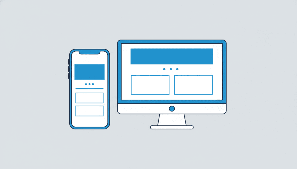
If you’ve been putting off dealing with your site’s mobile experience, the cost is real and ongoing — not theoretical. Mobile traffic now accounts for well over half of all web browsing, and in local service searches it’s even higher. Here’s what’s actually at stake.
Your Customers Are Searching on Their Phones
When someone in the Phoenix metro needs an HVAC technician, a dentist, or a contractor, the first thing they do is pull out their phone. They search, they scan results, they click a link, and they make a snap judgment about whether a business looks legitimate within about ten seconds. If your site pinches and zooms, pushes text off the screen, or has buttons too small to tap — you lost them.
This isn’t a fringe use case. The customers you most want to reach — busy professionals, homeowners, people who are already in-need — are conducting these searches overwhelmingly on mobile. A site that doesn’t work on a phone isn’t just inconvenient; it’s actively pushing leads to competitors whose sites do work.
For businesses that serve specific Phoenix neighborhoods and suburbs, this mobile-local search combination is especially powerful — and losing it is especially costly. See how this plays into local web design strategy for Scottsdale and nearby cities.
Google Has Been Mobile-First Since 2019
In 2019, Google switched to mobile-first indexing. That means Google primarily uses the mobile version of your site to determine your search rankings — not the desktop version. If your mobile site is broken, incomplete, or missing content that exists on desktop, Google sees a weaker site and ranks you accordingly.
The practical implications:
- A site that looks great on desktop but is broken on mobile will rank poorly — for everyone, including desktop searchers.
- Mobile page speed directly affects your Core Web Vitals scores, which Google uses as a ranking signal.
- Content that’s hidden on mobile (collapsed menus, small-print text) gets less SEO weight.
A properly built WordPress site designed mobile-first from the start sidesteps all of these issues by default. This is a design decision, not an afterthought.
What “Mobile-Friendly” Actually Means
Mobile-friendly is a higher bar than most business owners realize. Passing Google’s basic mobile-friendly test is the floor, not the ceiling. A genuinely mobile-optimized site means:
- Responsive layout: Content reflows naturally to any screen width without breaking or overflowing.
- Tap targets: Buttons and links are at least 44 pixels in every direction — a thumb can tap them reliably.
- Readable text without zooming: Body text at least 16px, with adequate line spacing.
- Fast on a mobile connection: Loads in under three seconds on a typical 4G connection, not just on your office WiFi.
- Accessible CTAs above the fold: A prospect should be able to call you or find your address without scrolling.
- Forms that work on mobile keyboards: Input fields that trigger the right keyboard type (email, number, etc.) and don’t get obscured by the keyboard.
Most sites that were built before 2020 — or built quickly on a budget — fail several of these criteria. If you’re not sure where your site stands, view it on your own phone and try to complete the actions a new customer would take.
The Conversion Impact Is Direct
Mobile experience isn’t just about search rankings — it’s about what happens after someone arrives. Conversion rates on mobile-optimized sites consistently outperform poorly optimized sites by a significant margin. A visitor who lands on a site that’s hard to navigate will leave. A visitor who lands on a site that’s clean, fast, and easy to use on their phone will stay and convert.
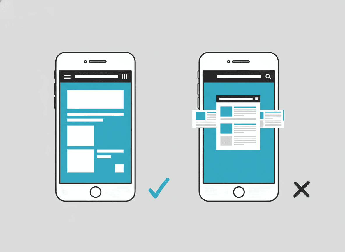
This is one of the core principles behind how we approach custom web design — we design for the mobile use case first, then scale up. That approach is also reflected in our thoughts on what makes a website actually convert.
If your site is already mobile-friendly but you’re still not seeing leads, the issue is likely conversion architecture — see our guide on that. If your site isn’t mobile-friendly yet, that’s a more urgent problem that a redesign should address immediately.
How to Know If Your Site Has a Mobile Problem
Quick tests you can run today:
- Open your site on your phone and try to navigate it as if you were a new visitor.
- Run Google’s PageSpeed Insights on your URL (free at pagespeed.web.dev) — look at the mobile score.
- Check your Google Search Console for mobile usability issues if you’ve set it up.
- Look at your analytics: what percentage of your traffic is mobile? What’s the bounce rate on mobile vs desktop?
Mobile-first design is now table stakes rather than an edge — for the wider picture, see our overview of web design trends for 2026.
If the mobile score is below 70, or your mobile bounce rate is significantly higher than desktop, or you’re just embarrassed by the experience — that’s your sign. Get in touch and we’ll give you an honest assessment of what needs to change.
Frequently asked questions
How do I know if my website is mobile-friendly?
The fastest test is to open your site on your own phone and try to navigate it as a new customer would. For a more technical assessment, run your URL through Google’s PageSpeed Insights (free at pagespeed.web.dev) and look at the mobile section. Google Search Console also flags specific mobile usability issues if your site is registered there.
Does a mobile-friendly site cost more to build?
Not if it’s built right from the start. A responsive design — one that adapts to any screen size — is the standard approach for any well-built site today. The extra cost comes when a site was originally built desktop-only and needs to be retrofitted for mobile, which is often messier and more expensive than rebuilding properly.
Will fixing my mobile site improve my Google rankings?
Very likely. Since Google uses mobile-first indexing, a better mobile experience directly improves how Google evaluates your site. Faster load times, better Core Web Vitals scores, and properly structured content on mobile will improve your technical SEO foundation. It won’t instantly move you to page one, but it removes a significant ranking handicap.
What’s the difference between responsive design and a mobile version of a site?
Responsive design means a single site that reflows and adapts its layout to any screen size — one codebase, one URL. A “mobile version” (like an m.yoursite.com) is a separate site built specifically for phones. Responsive design is the modern standard and is much easier to maintain. Separate mobile sites are outdated, harder to keep in sync, and not what Google recommends.
My desktop site looks great. Why would I need to change it just for mobile?
Because your customers aren’t primarily on desktop when they’re looking for a local service. Mobile traffic dominates local searches. A beautiful desktop site that’s broken on phones is invisible to the majority of your potential customers at the moment they’re most likely to act. The business case for fixing the mobile experience is usually very clear when you look at where your actual traffic comes from.